Website Redesign UI/UX Case Study
Schaefer's, an appliances, electronics, and mattresses store, had a website that required updates to it's site structure, user experience, and brand presentation. After conducting an initial interview with them to identify the issues, I proceeded to research other areas of user experience and site performance improvements that could be made to solve them.

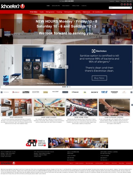
There were several issues identified with the website that required improvement centered around brand identity and user experience. The site was also missing a great deal of information about their featured brands, atmosphere, culture, and history.

Update and modernize the website's design and menu structure to guide users to popular products and features, and add content to better represent their brand and match the experience provided to visitors to their store.

After meeting with Schaefer's I was able to identify the main pain points they were experiencing on their website. The following are the main issues we identified:
Schaefer's communicated that visitors were having trouble locating products and services on their site. More specifically, the navigation menu was not presenting the types of products visitors were searching for, especially on mobile. There were also other issues including the location of the cart, account, and shipping information tools.

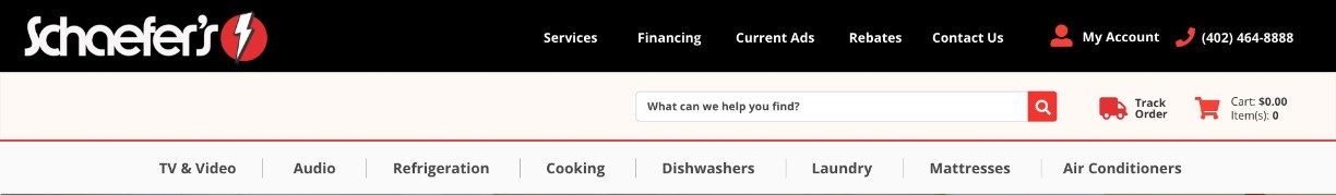
Comparing analytics of users interactions before and after the menu updates shows that users found and utilized the track order, account, and cart options more frequently and also interacted with the products menu 200% more often. This resulted in the sale of products that had previously not sold frequently on the site.
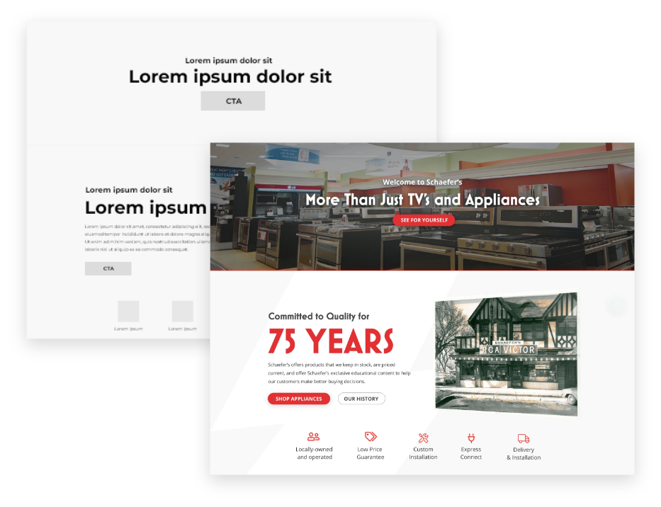
After establishing what information and sections were required, I created a wireframe to block out that content and provided sample content taken from their mission statements and discussions for consideration.
Once the wireframe was approved and all text for the sections created. I created the initial mockup.
View MockupOnce the design had been approved by the client it's time to begin user testing on a dev site and confirm the design is working as intended and repair any issues before launch.

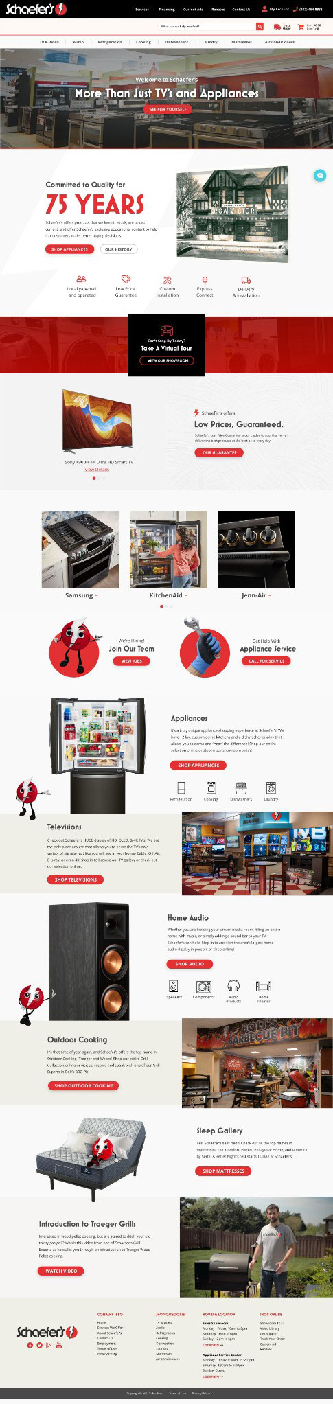
The client was happy with the new design and began creating new promotional content to display. Analytics registered improved user interaction on the site and a greater time spent browsing products. The new site design also included relevant SEO keywords they weren't previously ranking for. Users who were having trouble navigating to products and services were now able to find what they were looking for.